Plant Nursery Home Page Redesign
_edited.jpg)
Overview
Objective: Increase purchases and customers that return to shop by designing a more inspiring home page through adding relevant categories, brand voice, and high quality imagery.
Problem statement: The company is losing sales because customers find the current plant store website boring, uninspiring and lacking information, so they are shopping elsewhere.
Role: Designer, Researcher, Copy Writer.
Research
Forty people responded to a survey which I posted on surveymonkey.com and an additional six respondents chose to do so by email. I was trying to find out more about who the online plant shopper is, and what is it they need and want from an online plant store.
Pain points: Users were apprehensive about shopping for plants online because they find most plant websites uninspiring due to their poor navigation, bland photos, and lack of product and plant information.


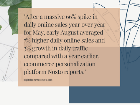
Secondary Research


User Persona
This user persona was created based on the data found in the survey and from the secondary research.
Lofi Wireframing
Once the objective, the user and user pain points are identified I move onto wireframes.

Information Architecture
I made IA to see how the browsing and navigation of the lofi wireframe improved compared to the original design. The original home page IA has much more to click through compared to the updated home page IA. I went with a design that offered less categories. This created more space and silenced all the extra words from the original home page.

Hifi Wireframing
Since the IA fit the needs of what we wanted, I moved onto hifi wireframes.

Hifi Prototyping
As a UX team of 1 I didn't have a team to get feedback from or test out the wireframe. I chose to proceed with prototyping and prioritized observing and probing for the right questions during user testing and usability testing to see if the layout and copy was suitable for the users.

A/B Testing
There were seven volunteer user testers. Six out of seven preferred the new home page design. Only one had a true preference for the original design. After each user tested the prototype, the prototype was updated based on their feedback.


User Feedback
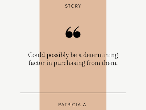
Alexa, Grace and Mimi were of the five user testers who shared a preference for the new home page prototype design over the original website's design. These were common sentiments that the users shared.

Iterations
Changes were made in terms of theme colors, font, point, brand voice, copy, company story, and simplifying navigation.

Final Iteration
Key learnings: Most plant shoppers are more likely to go straight to a category or even use the search bar if they know exactly what it is that that they want.
Even though plant shoppers are very straight forward with their shopping they still want to be inspired by aesthetic, story, and brand voice because shopping for plants is a creative, calming and conscious experience for them.
The whole experience is what would make them likely to continue to shop at a specific website. The homepage would be where the user would either have their standards met or be disappointed.

Retrospective
Limitations and constraints: Due to the COVID19 pandemic, user testing had to be done remotely. This encompassed various challenges like poor internet connection and having to guide people through using computer programs. Lack of funding meant that I could only work with free resources which limited survey responders to 40 max on surveymonkey.com. I also had to find my own survey respondents. For the user testing I also had to search for my own users.
Solutions: Zoom chat allowed for user testing online to be possible though screen share and the feature to allow mouse access to the user. As for the surveys, I accepted the limit of 40 maximum on surveymonkey.com. I was able to find my users and survey respondents by posting links on reddit and various Facebook club pages. I happened to receive 6 direct messages from people who volunteered to take the survey through email instead of through survey monkey.
Next steps: I plan on taking these findings to work on my second case study in order to continue improving the UX of the website.


